
What you need to know
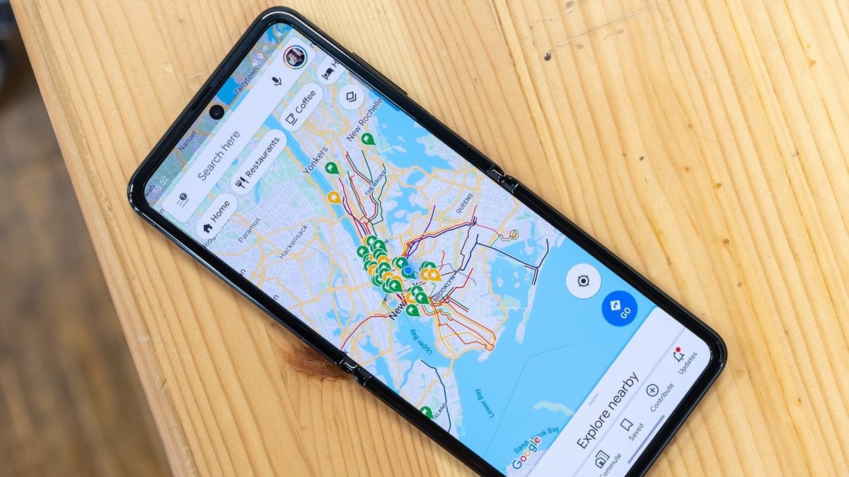
- Google Maps has started to reveal its new color palette, which includes a washed-out design across the globe.
- Streets and highways have become much more muted, causing the colors to almost blend into the foliage of the world.
- Google has also rolled in a new bold blue hue route indicator.
Google is rolling out a slight rework for its navigational app that is driving users a little bit mad.
A lengthy thread on Reddit with nearly three hundred comments discusses the latest color changes to Google Maps (via Android Authority). Much of the coloring in Maps has become much more muted, while others appear a bit too similar, making it harder to discern roads from land. According to the images, Google has altered regular street roads and highways to be gray instead of bright white or yellow.
Areas with a lot of foliage and large bodies of water look more washed out, which, to many users, is a bit odd to accept.
One user stated, “Yellow roads were so good, and everything was bright and cheery. Now it’s depressing and the roads are hard to see when not fairly zoomed in, they just don’t pop like the yellow did.”
Image 1 of 2

Google brought its updated color palette to the route indicator, making it a much deeper, bolder blue hue than before. However, alternate routes are now light blue instead of gray, which can make things a little confusing.
Users have even taken to X (formerly Twitter) to discuss the latest Google Maps changes — with very little to say positively. Many question the reasoning behind altering the color palette of the map to something that “breaks my brain,” per one user comment.
Google Maps widely rolling out new color palette pic.twitter.com/dZBT5cuPuoNovember 19, 2023
Additionally, one side-by-side photo comparing the old Maps to the new variant shows how different things are. Aside from roads and water looking a bit anemic, the pale theme impacts buildings and hospitals with a color that dilutes their visual appearances.
It’s not exactly clear why Google decided to change the color scheme of Maps. Several users, on both social media platforms, have mentioned seeing these changes a month ago. It would appear as though the company pushed it to a select few users, likely just testing the waters, before releasing it into the wild. Although, with the sudden backlash as more and more receive it, it’ll be interesting to see where Google finds itself next.
Android Auto was on the receiving end of some Google Maps changes, but these came without any color alterations. Instead, it gained minor navigation changes like a bolder time estimate in the bottom left-hand side and other UI shifts.
For mobile, Maps’ recent update last week improved public transit recommendations by adding new station entrances and route customizations. Moreover, the update brings a little more interactivity for users who post photos for restaurants by letting them add emoji reactions.